Even if you didn’t own a home at the time, you probably remember the housing crisis in 2008. That crash impacted the lives of countless people, and many now live with the worry that something like that could happen again. But rest easy, because things are different than they were back then. As Business Insider says:
“Though many Americans believe the housing market is at risk of crashing, the economists who study housing market conditions overwhelmingly do not expect a crash in 2024 or beyond.”
Here’s why experts are so confident. For the market (and home prices) to crash, there would have to be too many houses for sale, but the data doesn’t show that’s happening. Right now, there’s an undersupply, not an oversupply like the last time – and that’s true even with the inventory growth we’ve seen this year. You see, the housing supply comes from three main sources:
- Homeowners deciding to sell their houses (existing homes)
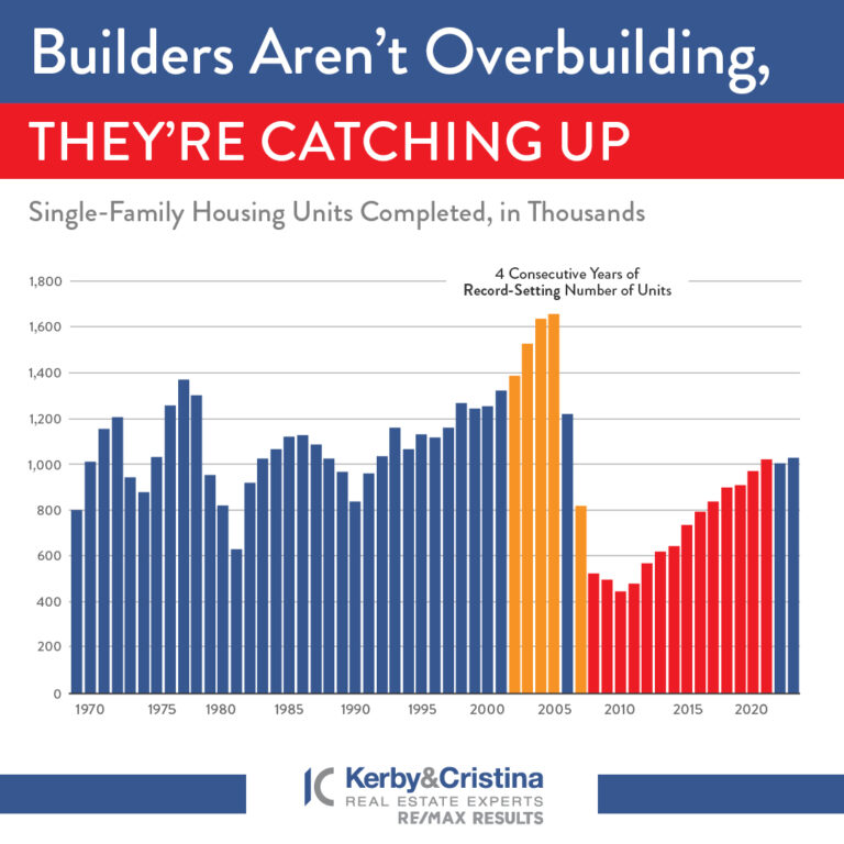
- New home construction (newly built homes)
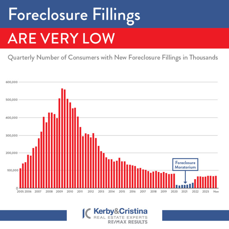
- Distressed properties (foreclosures or short sales)
And if we look at those three main sources of inventory, you’ll see it’s clear this isn’t like 2008.
Homeowners Deciding To Sell Their Houses
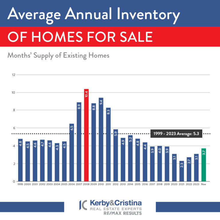
Although the supply of existing (previously owned) homes is up compared to this time last year, it’s still low overall. And while this varies by local market, nationally, the current months’ supply is well below the norm, and even further below what we saw during the crash. The graph below shows this more clearly.
If you look at the latest data (shown in green), compared to 2008 (shown in red), we only have about a third of that available inventory today.


